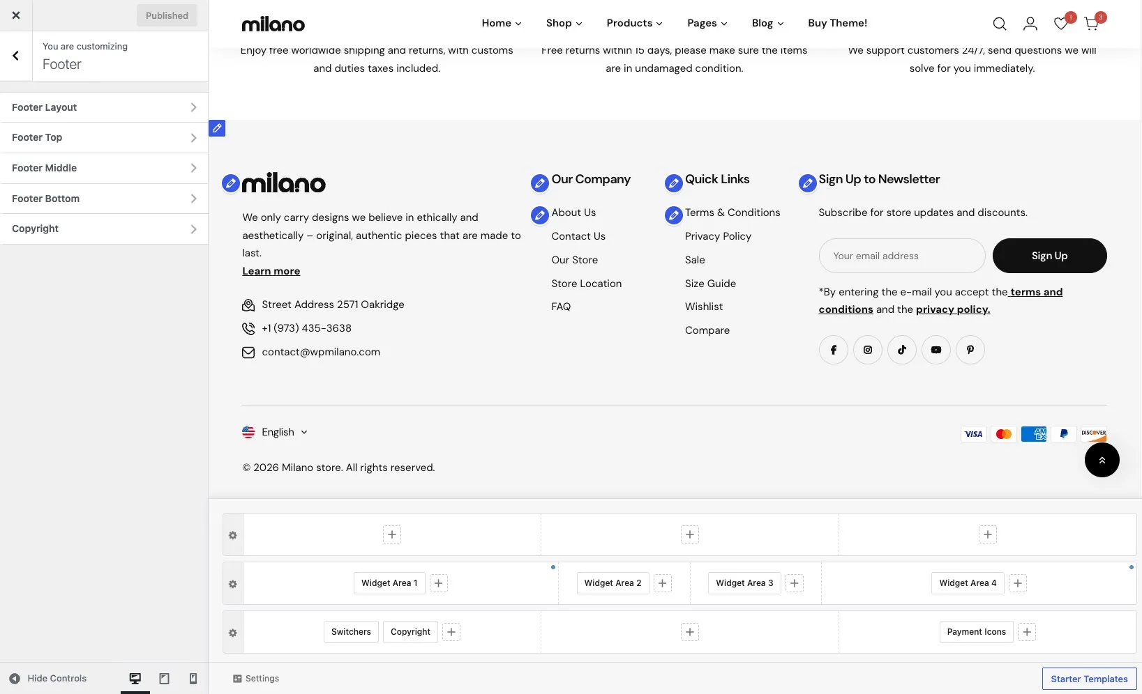
Footer builder
Open Appearance → Customize → Footer Builder to open the footer builder.
Row structure
Section titled “Row structure”The footer has up to three rows stacked vertically. Each row is divided into columns — you choose how many.
| Row | Description |
|---|---|
| Footer top | The top footer row. Use it for widgets, announcements, or social links. |
| Footer middle | The main footer row. Typically contains widget columns and your footer menu. |
| Footer bottom | The bottom row. Use it for copyright text, payment icons, or legal links. |
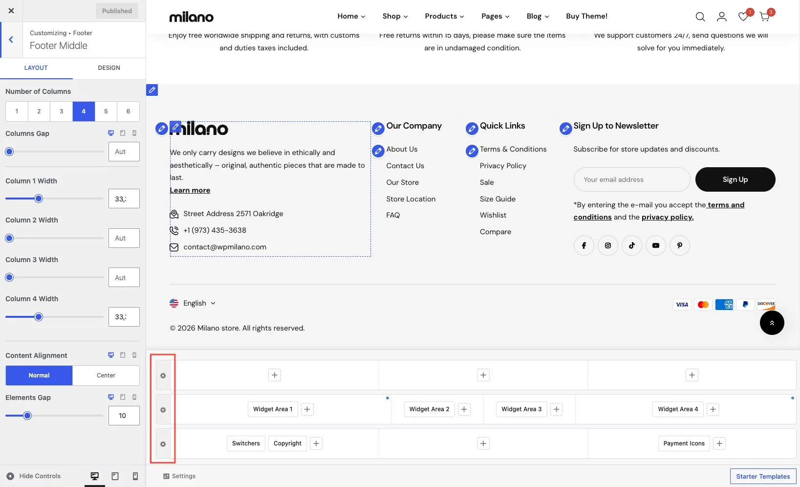
Columns
Section titled “Columns”Each row can have a different number of columns. You set the column count in the row settings. Common layouts include:
- 1 column — full-width content like a newsletter form or copyright text
- 3 columns — three widget areas side by side
- 4 columns — four widget areas, often used for link lists and contact info
Elements and widgets distribute across the columns you’ve set. You can add multiple elements to the same column.
Add an element
Section titled “Add an element”- Find the row and column where you want the element to appear.
- Click + Add Element in that column.
- Choose an element from the list.
- The element appears in the column.
Remove an element
Section titled “Remove an element”Hover over the element and click the X icon that appears next to its label.
Row settings
Section titled “Row settings”Each row has its own settings panel. Click the row to open it. You can configure:
| Setting | Description |
|---|---|
| Column count | Number of columns in the row (1–4). |
| Column widths | Customize the width of each column. Defaults to equal widths. |
| Column gap | Spacing between columns. |
| Background color | Background color for the row. Supports solid colors and gradients. |
| Text color | Default text and link color for elements inside the row. |
| Padding | Top and bottom padding for the row. |
| Container width | Make the row full-width or constrained to the site container. |
| Border | Add a top border to separate the row from the content above. |
Copyright element
Section titled “Copyright element”The footer includes a dedicated Copyright element for your copyright notice. It supports two placeholders:
| Placeholder | What it replaces |
|---|---|
{year} | The current year (updates automatically) |
{site_title} | Your WordPress site title |
The copyright text, typography, and colors can also be set in Appearance → Customize → Footer → Copyright.
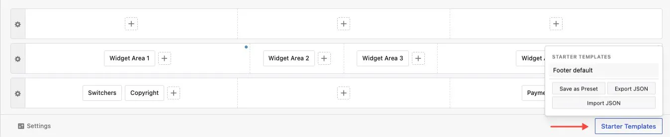
Templates
Section titled “Templates”The footer builder includes prebuilt footer templates you can import to get started quickly. You can also save your own layouts as templates to reuse across sites.
Click Templates at the bottom right of the footer builder to open the template dialog. From there you can:
- Import a template — browse the list of prebuilt footers and click one to apply it. It replaces your current footer layout.
- Save current layout — save your footer as a custom template with a name you choose.
- Remove a template — delete a custom template you no longer need.
Available elements
Section titled “Available elements”- Footer Menu — footer navigation menu
- Widgets — WordPress widget areas within the footer
- Copyright — copyright text with year and site title placeholders
- Social Links — links to your social media profiles with icons
- Custom HTML — your own HTML content