Mobile bottom bar
The mobile bottom bar is a fixed row of icons at the bottom of the screen on phones and tablets. Visitors tap an icon to navigate — no scrolling up, no hunting for the hamburger menu.
This is a mobile-only feature. It does not appear on desktop screens.
Turn on the bottom bar
Section titled “Turn on the bottom bar”- Go to Appearance → Customize → Mobile → Bottom Bar.
- Check the Enable Bottom Bar box.
- Click Publish.
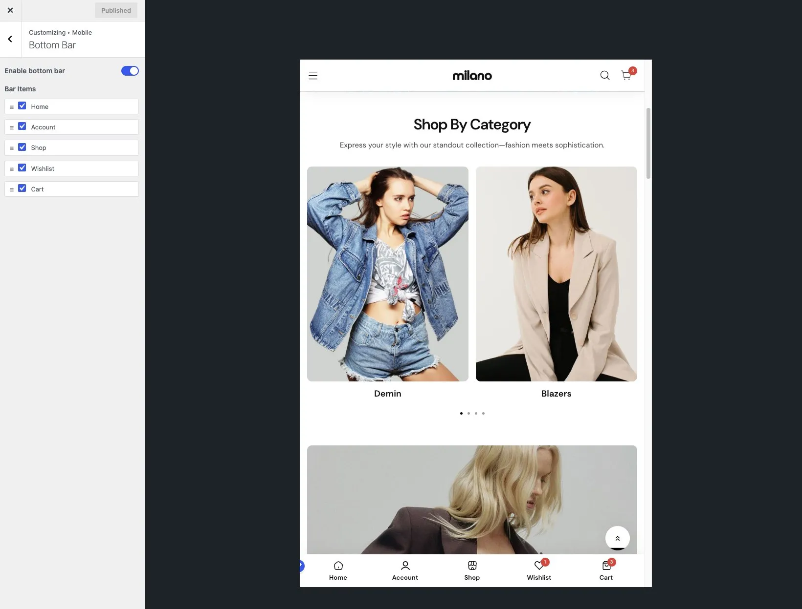
The bottom bar appears on all mobile pages once published.
Choose which icons appear
Section titled “Choose which icons appear”You pick the navigation items that matter most to your visitors. Typical choices are Home, Shop, Cart, Account, and Wishlist.
- Stay in Appearance → Customize → Mobile → Bottom Bar.
- Find the list of bar items. Each item has a checkbox.
- Check the items you want to show. Uncheck the ones you don’t.
- Arrange items by dragging them into your preferred order.
- Click Publish.
The bar uses the icons built into Milano for each item. You don’t need to upload icon images.
Use cases for each item
Section titled “Use cases for each item”| Item | When to show it |
|---|---|
| Home | Always useful — gives visitors a familiar reset |
| Shop | Great for stores where browsing is the main action |
| Cart | Essential for conversion — one tap to review items |
| Account | Helpful if you expect repeat buyers to sign in |
| Wishlist | Best for stores where visitors save items to compare |
Rearrange icon order
Section titled “Rearrange icon order”- In the Bottom Bar panel, find the bar items list.
- Drag any item left or right to change its position.
- Click Publish.
The first item appears on the far left, the last on the far right.
Customize the bar colors
Section titled “Customize the bar colors”- In the Bottom Bar panel, look for the color settings.
- Set the Bar background color and the Icon color.
- Click Publish.
Colors apply to all icons in the bar. You cannot color individual icons differently.
What happens on desktop
Section titled “What happens on desktop”The bottom bar hides automatically on screens wider than the mobile breakpoint. You don’t need to do anything. If you want a persistent navigation on desktop, use the sticky header instead.
Troubleshooting
Section titled “Troubleshooting”Problem: The bottom bar does not show on my phone. Fix: Confirm you checked Enable Bottom Bar and clicked Publish. Also check that you are viewing the site on a screen narrower than about 768 px.
Problem: An icon I added does nothing when tapped. Fix: The item might link to a feature that isn’t set up yet. For example, Wishlist needs a wishlist plugin. Account needs the WooCommerce My Account page.
Problem: The bottom bar covers content at the bottom of the page. Fix: Milano adds padding to pages automatically when the bottom bar is active. If a third-party plugin adds its own bottom bar, the padding can conflict. Try disabling the plugin’s bar.