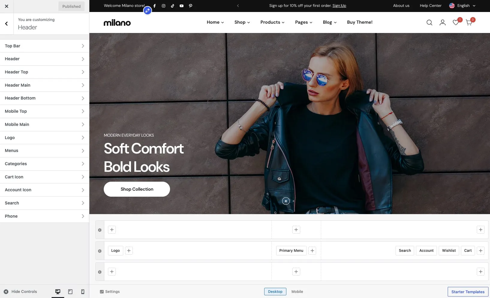
Header builder
Open Appearance → Customize → Header to open the header builder.
Rows structure
Section titled “Rows structure”The desktop header has three rows stacked vertically. Each row is divided into three columns — left, center, and right — so you can place elements on either side or in the middle.
| Row | Description |
|---|---|
| Header Top | A narrow strip above the main header. Use it for announcements, social links, language and currency switchers. |
| Header Main | The primary row with your logo, navigation menu, search, cart, and account icons. |
| Header Bottom | A row below the main header. Use it for category navigation, submenus, or any other element. |
Columns
Section titled “Columns”Within each row, elements sit inside one of three columns:
- Left column — elements align to the left (e.g. logo)
- Center column — elements sit in the middle (e.g. menu)
- Right column — elements align to the right (e.g. cart, account)
You can add multiple elements to the same column — for example, cart and account icons both on the right.
Add an element
Section titled “Add an element”- Find the row and column where you want the element to appear.
- Click + Add Element in that column.
- Choose an element from the list.
- The element appears in the column. Drag it left or right within the column to change its position among other elements in the same column.
Remove an element
Section titled “Remove an element”Hover over the element and click the X icon that appears next to its label.
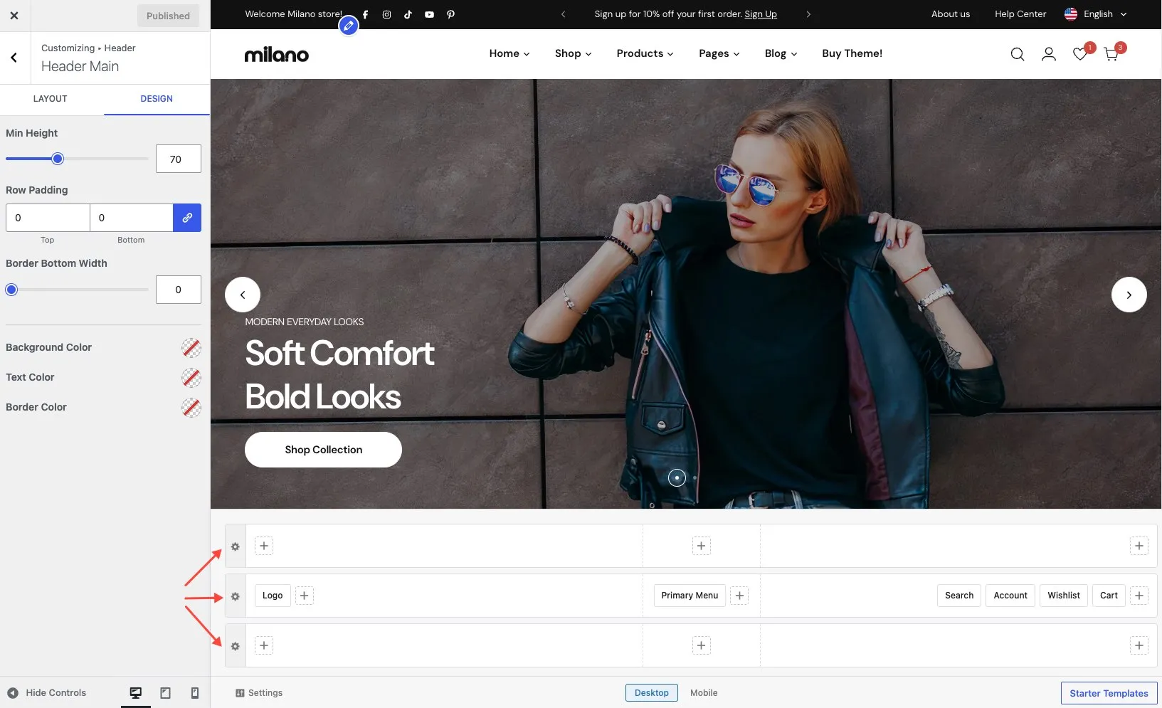
Row settings
Section titled “Row settings”Each row has its own settings panel. Click the row to open it. You can configure:
| Setting | Description |
|---|---|
| Row height | Set a fixed height or let the row auto-size to fit its content. |
| Background color | Background color for the row. Supports solid colors and gradients. |
| Text color | Default text and link color for elements inside the row. |
| Element gap | Spacing between elements within the same column. |
| Padding | Top and bottom padding for the row. |
| Border | Add a bottom border to separate the row from the content below. |
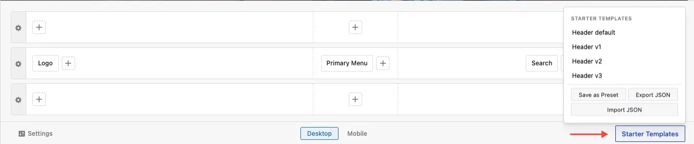
Templates
Section titled “Templates”The header builder includes prebuilt header templates you can import to get started quickly. You can also save your own layouts as templates to reuse across sites.
Click Templates at the bottom right of the header builder to open the template dialog. From there you can:
- Import a template — browse the list of prebuilt headers and click one to apply it. It replaces your current header layout.
- Save current layout — save your header as a custom template with a name you choose.
- Remove a template — delete a custom template you no longer need.
Available elements
Section titled “Available elements”- Logo — your site logo with alternative version for sticky/transparent states
- Primary Menu — navigation menu with dropdown options
- Search — search bar or icon with AJAX search
- Cart — shopping cart icon with item count (requires WooCommerce)
- Account — login link or account icon (requires WooCommerce)
- Phone — phone number with business hours
- Email — email address