Mobile header
The mobile header replaces the desktop layout when visitors view your site on phones and tablets. It uses the same header builder — you just switch between Desktop and Mobile tabs at the top of the builder to design each layout.
Design the mobile layout
Section titled “Design the mobile layout”Switch to the Mobile tab in the header builder. The mobile builder works the same way as the desktop one — add elements into rows and columns, configure row settings, and reorder by dragging.
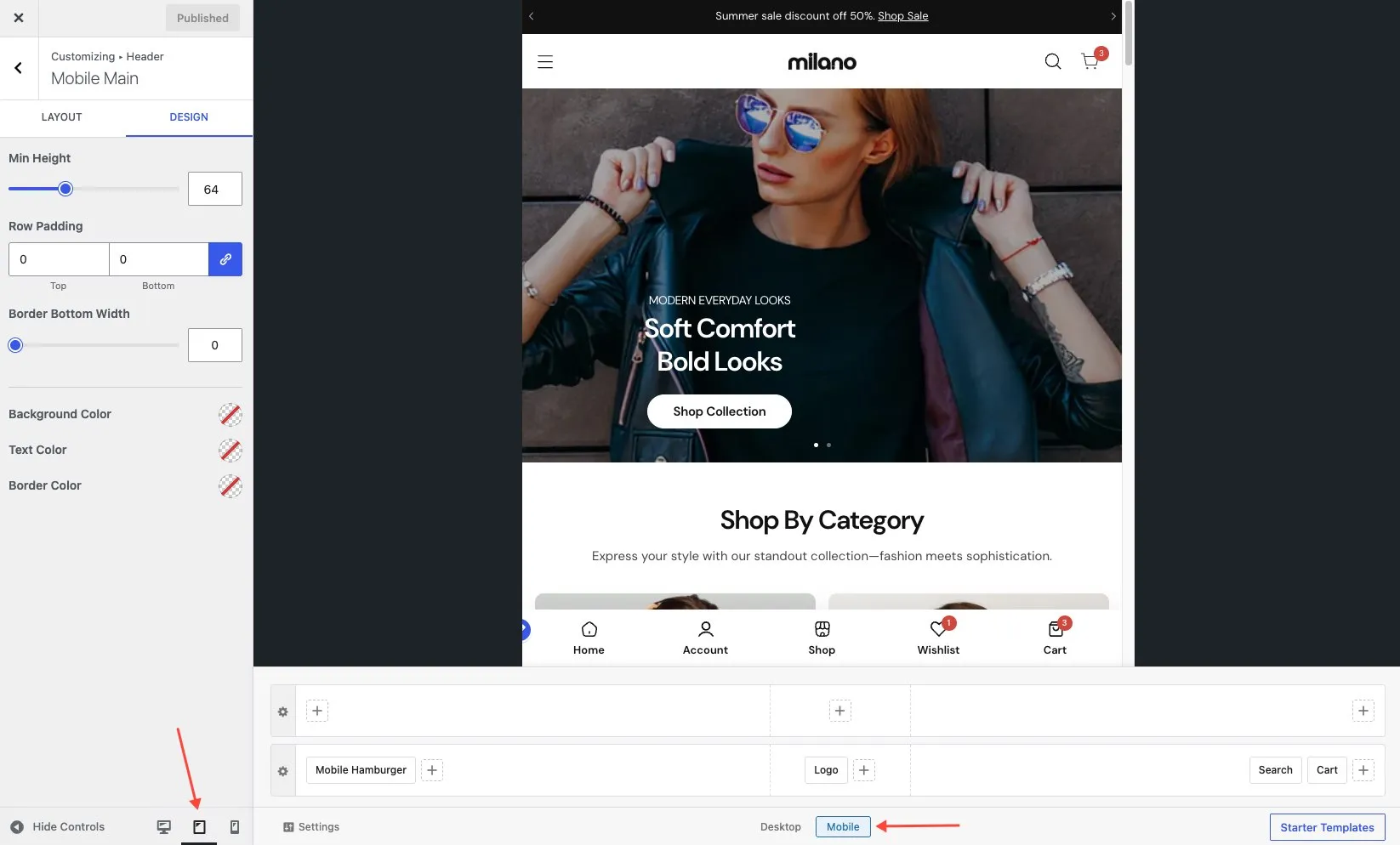
The mobile header supports the same elements but typically with fewer columns and simpler layouts:
- Logo — you can set a separate logo for mobile (see Logo settings)
- Menu icon — the hamburger button that opens the mobile menu
- Search — search icon
- Cart — cart icon with item count (requires WooCommerce)
- Account — account icon (requires WooCommerce)
Hamburger menu
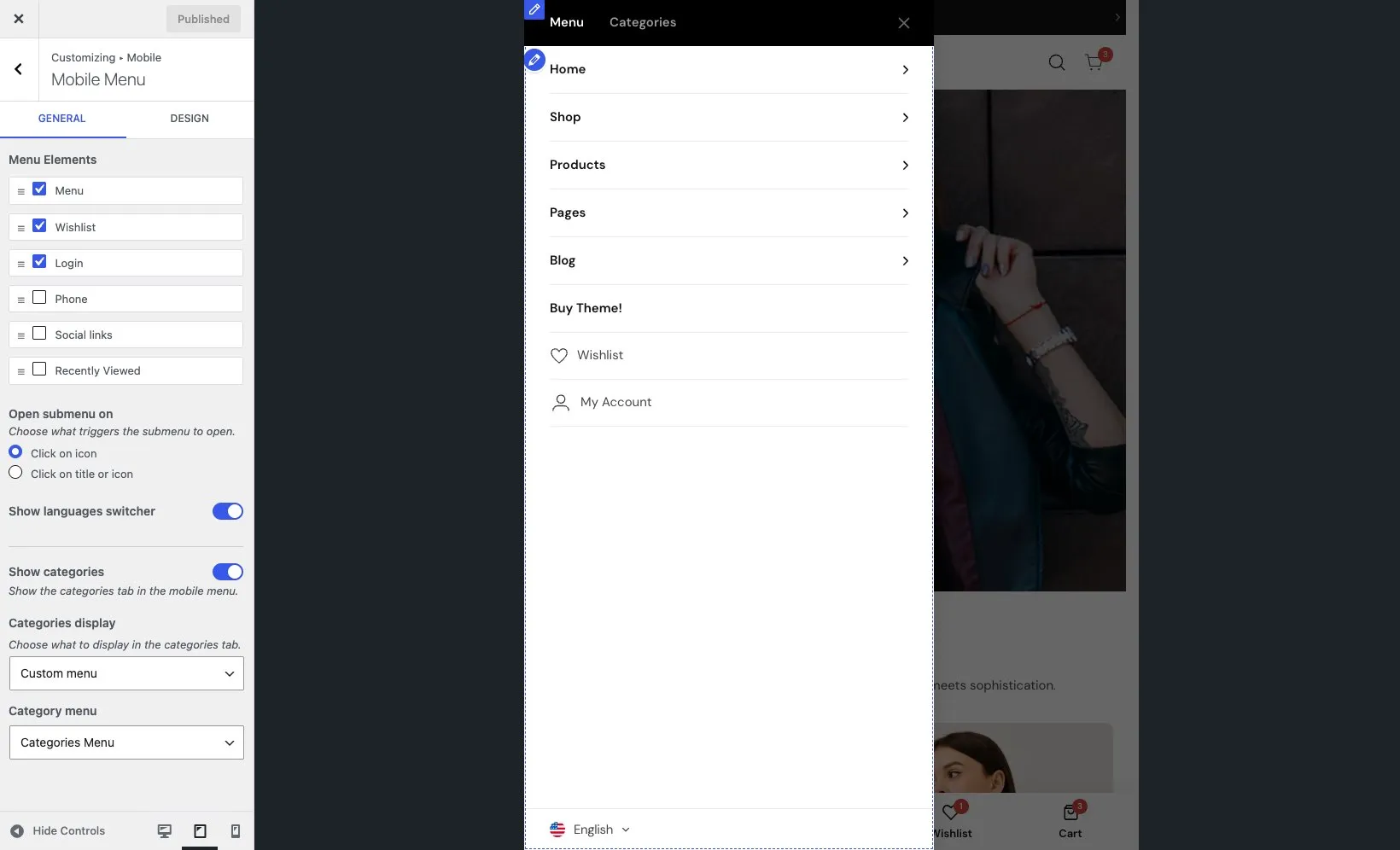
Section titled “Hamburger menu”The hamburger menu is the panel that slides in when a visitor taps the menu icon. You control what appears inside it from Appearance → Customize → Mobile → Mobile Menu.
Choose and order elements
Section titled “Choose and order elements”The hamburger menu can contain:
- Menu — the main navigation menu
- Phone — your phone number
- Social — social media links
- Login — login link or account icon
- Recently viewed — recently viewed products
- Wishlist — wishlist items (requires WooCommerce)
- Language switcher — available languages (requires WPML or Polylang)
- Currency switcher — available currencies (requires WooCommerce)
Add and arrange these items in the order you want them to appear in the hamburger panel.
Categories tab
Section titled “Categories tab”Turn on the Categories tab to show a second tab alongside the main menu. Visitors can switch between the menu and a category list — useful for stores with many product categories.
Colors and header style
Section titled “Colors and header style”The Mobile Menu panel also includes settings for the hamburger menu’s background color, text color, and header appearance.
Mobile logo
Section titled “Mobile logo”The mobile header can use a separate logo image, often a cropped or smaller version. If you don’t set a mobile logo, the desktop logo is used instead. You can upload a mobile logo in the Logo element settings. See Logo settings for more.